Small businesses and professional practices depend on their websites to bring in new leads. Yet many still lose potential customers because their sites do not display or function well on mobile devices. A responsive web design fixes that problem and turns every page into a lead-generation engine.
This guide explains what responsive web design is, how it works, and why it directly impacts user experience, search rankings, and conversion rates. You will learn how to build a responsive website using proven web development methods and why it pays off for your marketing and SEO goals.
What Responsive Web Design Means
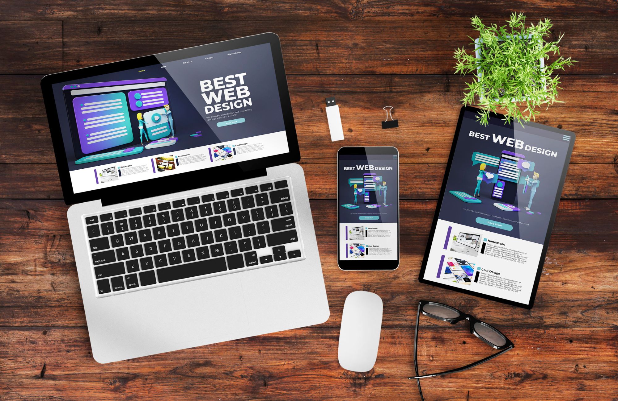
Responsive web design is the practice of creating web pages that automatically adjust their layout, images, and content to fit different devices and screen sizes. The same web page looks and performs well whether it is viewed on a desktop, tablet, or mobile phone.
A responsive website is not a separate technology or version of your site. It is a single design that adapts to the device width and browser window width through HTML and CSS. Developers use fluid grids, flexible images, and media queries to make web pages render correctly across various devices.
When done right, responsive design adapts to user behavior in real time. As the browser window resizes, the content reorganizes itself without breaking layout or readability. This means every visitor gets a consistent user experience, no matter how they access your website.
How Responsive Web Design Helps Generate Leads
A responsive web design helps generate leads by making your website easy to use on any device. When web pages render correctly across different screen sizes, visitors stay longer, read more, and are more likely to contact your business. Below explains how responsive design improves visibility, engagement, and conversions across every stage of the buyer journey.
More Visibility in Search Results
Search engines prioritize mobile-friendly design. Google’s mobile-first indexing means your mobile version determines your ranking. A responsive site helps your web pages appear higher in search results, driving more qualified traffic and potential leads.
Better User Experience
Mobile users expect web pages to load fast and display correctly on small screens. A responsive page with clear navigation and readable text keeps visitors engaged longer and reduces bounce rates.
Higher Conversion Rates
When users can read, scroll, and act without zooming or pinching, they are more likely to contact you, request a quote, or make a purchase. A responsive website simplifies this process, directly improving conversion rates.
Lower Maintenance Costs
In the past, businesses built several versions of a website for different screen sizes. Responsive web design eliminates that need. You maintain one codebase and one content set, saving time and cost.
Consistent Branding
Responsive designs preserve visual identity across devices. Whether someone views your desktop version or mobile version, they recognize your brand immediately.
Core Building Blocks of Responsive Web Design
Creating a responsive website relies on several technical foundations that work together.
Fluid Grids
A fluid grid uses relative units instead of absolute units. This allows the layout to automatically resize as the browser window changes. The flexible grid determines how content reflows on large screens and small screens.
Example:
| Unit Type | Description | Example |
|---|---|---|
| Absolute units | Fixed pixel values | width: 1200px |
| Relative units | Scale based on parent element | width: 80% or width: 60vw |
Relative units let your web page fill available space without breaking the layout on different devices.
Media Queries
Media queries are CSS rules that apply different styles based on device width, screen resolution, or orientation. A common pattern uses multiple breakpoints, such as 480px, 768px, 1024px, and 1280px, to adjust layout and typography.
Basic CSS example:
@media (max-width: 768px) {
.container {
flex-direction: column;
}
}
This approach makes responsive web designs adapt smoothly between mobile devices and desktops.
Flexible Images and Responsive Images
Images must scale to fit the container. Developers use the CSS max-width property or the srcset attribute to serve properly sized images depending on screen width. SVGs are also useful for logos and icons since they stay sharp regardless of screen resolution.
Responsive Typography
Readable text keeps users on your web pages longer. Responsive typography uses viewport units and relative font size to adjust automatically. For example, font-size: clamp(1rem, 2vw, 1.5rem) ensures type scales proportionally with the screen size.
Viewport Meta Tag
Every responsive web page needs this tag in the HTML head:
<meta name=”viewport” content=”width=device-width, initial-scale=1″>
Without it, mobile browsers render your desktop version incorrectly and reduce readability.
Ready to turn your website into a responsive lead engine? Work with experts who specialize in building responsive web pages that drive conversions. Learn more about our web design services at ChitChat Marketing
How Responsive Design Boosts User Experience
User experience affects whether a visitor becomes a lead. A responsive design improves navigation, readability, and accessibility across all screen sizes.
Navigation and Layout
Responsive design improves navigation by keeping layouts simple and user-friendly. Use a single-column layout on mobile devices for easier scrolling and faster access to information. Keep menus short, with clear icons and concise labels. Key calls to action, such as “Call Now” or “Request a Quote” should appear at the top of each web page so mobile users can act without searching or scrolling.
Forms and Buttons
Clean, accessible forms and buttons increase conversions on a responsive website. Limit fields to essential details like name, email, and phone number. Use large, well-spaced buttons that are easy to tap on mobile phones, and enable auto-detect input types to show the right keyboard, for example, a number pad for phone fields. These adjustments improve form completion rates and user experience.
Visual Hierarchy
Good visual hierarchy helps users focus on what matters. Place headlines and value propositions at the top of small screens where they are immediately visible. Maintain consistent spacing and color contrast to guide the reader’s attention. Using the same brand colors, font size, and style across all devices reinforces trust and keeps your responsive web pages looking professional and familiar.
Page Speed and Performance
Performance affects both ranking and conversions. Compress large images to reduce file size, defer non-essential JavaScript, and use caching with a content delivery network (CDN) to deliver assets faster. These steps improve load time, reduce bounce rates, and help convert mobile users into paying customers.
Web Development Approaches to Responsive Design
Responsive design can be built using different methods depending on your resources and goals.
| Approach | Description | Best For |
|---|---|---|
| Mobile first design | Start with the mobile version and scale up to desktop | SEO and performance focus |
| Fluid layouts | Use percentages and flexible grid units | Most modern websites |
| CMS themes | Choose responsive templates for WordPress or Shopify | Small business sites |
| Custom build | Code layouts with HTML, CSS Grid, and Flexbox | Custom or large-scale websites |
Modern technologies like Flexbox and Grid make it easier to build websites that automatically resize without heavy frameworks. You can even start with only HTML and CSS and expand later with a JavaScript library for interactive features.
Implementation Roadmap: Building a Responsive Site That Converts
- Audit your current site: Identify how web pages render across browsers and devices. Check load time, bounce rate, and conversion rates by screen size.
- Set goals: Decide which actions define success, contact form submissions, appointment bookings, or product purchases.
- Design mobile first: Create the layout for small screens first, then add features for larger ones. This prevents content overload and improves mobile friendliness.
- Apply responsive design elements: Use fluid grids, media queries, responsive images, and consistent typography to make every responsive page flexible.
- Optimize content: Simplify headings and copy for faster scanning. Remove clutter and focus on one clear call to action per section.
- Test on real devices: Preview on various devices and browsers. Adjust breakpoints, check screen resolution behavior, and confirm buttons and forms work.
- Monitor and improve: Use analytics to track leads, conversion rates, and page engagement. Continue refining layout and content based on data.
Want expert help implementing these steps? Our team at ChitChat Marketing builds responsive sites that attract and convert high-quality leads. Request a web design quote today.
Common Responsive Design Mistakes
Avoid these errors that often reduce conversions:
| Mistake | Problem | Fix |
|---|---|---|
| No viewport meta tag | Layout breaks on mobile devices | Add the correct meta tag |
| Using absolute units | Content doesn’t resize | Use relative units |
| Ignoring large screens | The layout looks empty on desktops | Add max-width rules |
| Oversized images | Slow load time | Compress and resize images |
| Hidden CTAs | Lower conversions | Keep calls to action visible |
| Too many breakpoints | Complex maintenance | Stick to 3–5 core breakpoints |
Simple fixes in CSS and layout can make a major difference in how responsive designs perform.
Analytics and SEO Integration
Responsive design and SEO work together. A single responsive site helps search engines crawl, index, and rank your web pages more efficiently.
Track these metrics after launch:
- Mobile vs. desktop traffic
- Conversion rates per device
- Page load time
- Bounce rate by screen size
- Click-to-call and form submissions
A/B test headlines, buttons, and layouts across breakpoints to identify what performs best for each audience segment.
Why Small Businesses Need Responsive Web Design
Most web traffic today comes from mobile devices, and those users expect fast, readable web pages. A responsive site meets those expectations and sends stronger trust signals to potential customers. For service-based businesses like dental practices, med spas, or ABA therapy providers, this can directly translate to more calls and appointments.
A responsive website also supports all other marketing efforts. Paid ads lead to better Quality Scores. Social media traffic lands on pages that load correctly. And SEO campaigns benefit from lower bounce rates and higher engagement.
Conclusion
A responsive web design gives your business a single, consistent website that works across all devices. It simplifies updates, keeps branding uniform, and creates a better user experience that reduces bounce rates and increases engagement. With improved mobile friendliness, your site gains higher SEO rankings and better visibility in search results. Faster load times and a data-driven layout lead to stronger conversions and measurable results. For small businesses, a responsive site is not just about design; it’s one of the most effective ways to generate leads and grow online.
At ChitChat Marketing, we build responsive websites designed to perform. Every site is crafted with modern web development practices, cascading style sheets, and responsive design techniques that make your business stand out on any screen size. We focus on creating pages that attract qualified traffic, engage visitors, and convert them into customers. If you’re ready to improve performance and results, schedule a consultation with us today.
FAQs
What is responsive web design?
Responsive web design is a method of building web pages that automatically resize, rearrange, and adapt to fit different screen sizes and devices. It uses HTML, CSS, and media queries to make sure websites look and perform well on desktops, tablets, and mobile phones.
What are examples of responsive web design?
Examples of responsive web design include sites that adjust layouts and images based on browser width. Popular brands like Starbucks, Dropbox, and The New York Times use responsive web pages that adapt smoothly between mobile and desktop versions for consistent user experiences.
How do I create a responsive website design?
You can create a responsive website using HTML and CSS with media queries, flexible grids, and responsive images. Start with a mobile-first design approach, set the viewport meta tag, use relative units for layout, and test across multiple devices to confirm consistent performance.
What are RWD principles?
The core principles of responsive web design (RWD) are fluid grids, flexible images, and media queries. These allow a website’s layout to adjust automatically to screen size, creating a mobile-friendly design that improves user experience and engagement.